Google streetview is violating our pirvacy???

There has been a lot of recent backlash directed at Google and the Street View team. Last month in Buckinghamshire, residents blocked the Google Street View team from entering their community due to concerns over privacy. They lived in an affluent area and were worried that criminals would be able to target their neighborhood if Google was allowed to photograph their houses.

Now, they’ve been blocked in Greece. See this article from Webuser.co.uk: Street View cars blocked in Greece. This is something I’ve been thinking about for a while. I recently spent a lot of time looking for a house and using Google maps was a fun way to check them out ahead of time. (As a side note, Why is it so damn entertaining to find funny pictures through Street View?!?!) Anyhoo, I never thought a bunch of criminals could be sitting at home on their stolen laptops and doing their B & E homework via Google Maps. Do they? And if they are scouting homes to rob in online map applications are these applications making them more efficient? And really, is this any different than them just getting in one of those new fangled things we call a car and simply driving around and using their eyes? I’m not sure if this should even be a big deal. How’s about you?

What are some of the best plugins for WordPress?

I’m glad you asked my friends. Here are a few articles on great plug-ins for WordPress.

  1. 20+ great wordpress plugins @ mashable
  2. 10-essential-wordpress-plugins-to-start-your-blog @ webesigner depot
  3. useful-wordpress-plugins @ webdesignerwall

I know most of you are probably experts by now, but there’s a few out there still getting into the blogoverse. Plus, it’s always good to see what others are using and keep an eye on the competition if they are competition. The Mashable list has some good ones outside the normal ones that everyone and their dog is using these days. Take a perusal and see if anything looks like it might help you.

Clean Markup and Validation??? Why should we care?

mr_clean_html

Have you ever tried to redesign anybody else’s Markup? Well, if you haven’t yet, you probably will have to in the not too distant future. If that person used sloppy code and extraneous CSS you’re gonna want to hunt them down and strangle them with your mouse (assuming yours isn’t wireless, then you can always throw it like it was some sort of Ninja throwing mouse, but I’d opt for shoving it down their throat. All I’m saying is it just seems more effective to me.) But I digress…
Why should you focus on good clean valid code and streamlined CSS?

Because, as we all know, times are a changing and the Web and its related technologies are changing even faster. You might not always be the one doing the redesign. Somebody else will probably come along after you and have to redesign a site you worked on. If you didn’t use clean markup you better watch out for mouse-wielding designers with an angry look to them! (remember above scenario involving mouse violence?) Anyways, this is a great article from Alvaro Guzman at the Web Designer Depot is a great study of the importance of clean markup. Enjoy, and discuss amongst yourselves. You have the topic…

Why Does Clean Markup Matter in Web Design?

Get outside the box to get outside the box.

I know I’ve written about inspiration before but that is always one of my sticking points. Getting started and getting inspired are my biggest stumbling blocks. I don’t know about you guys, but dang, just getting some of those first ideas rolling is my “Achilles Heel.”

This article by Micheal Shelton posted @ webdesignerdepot has some great tips to help get the creative juices flowing.

I especially like these ideas. finding an object, placing it on your desk and designing around it. Nice idea.

  1. Pulling a random word from the dictionary and formulating ideas incorporating the word is an interesting idea.
  2. Find an object, place it on your desk and design around it. Nice idea.
  3. Get back to art history
  4. Get out and take some pictures in nature

There are some really great ideas in this article. Definitely worth checking out.

Zoo Poster

This was one of my first Adobe Illustrator projects. The goal was to produce a poster for the San Diego Zoo where the main focus was an animal created using gradients and the gradient mesh tool. I thought a Zebra would present an interesting challenge and cause a large amount of meticulous work… Turns out, it did. I was seeing stripes for days!

S.P.O.R.T. Center Website

S.P.O.R.T. Center Website

This was a Web-Campaign project. The goal of this project was a web based marketing campaign for a fictional company. Primary tasks were to develop a corporate idendity (Logo), and create a multi-page site containing company info and contact form, and Email blast info page.
Click Here to visit site: S.P.O.R.T. Center Website

Magazine Cover

This was an Adobe Photoshop/Illustrator marketing project. The goal was to design a cover for an existing publication using certain techniques. The techniques to be used were photo filters and warps. Also learned in this project were packaging and output for print techniques.

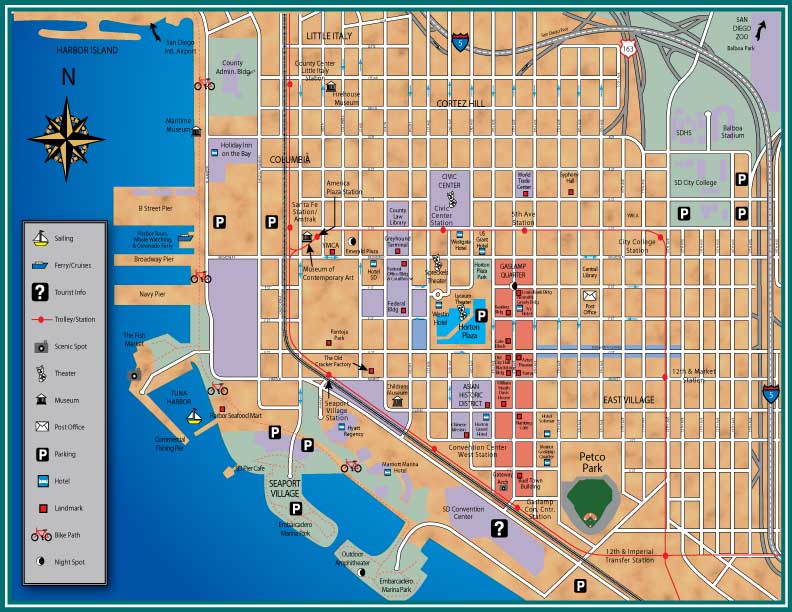
San Diego Downtown Map

This was another Adobe Illustrator project. The goal was to create a map of Downtown San Diego using specific Illustrator techniques. Mainly the layer style function and path style definitions. As this is one of the “coolest” areas of San Diego this was a fun project to work on.

Camaro

This was an Adobe Illustrator project. The goal was to create an object using gradients and the gradient mesh tool. I chose to re-create a Chevy Camaro because I thought the lighting and metallic texture would present a good challenge. I always like to challenge myself, especially while learning. I think that it helps the technique “sink” in more that way.

Fur Campaign

This was an anti-fur class project. We were to design a poster for the Fur Free Alliance. The goal of the ad was to disuade people from wearing fur with vivid imagery. My concept was to have a beautiful girl on the poster, but make it appear as if an animal was wearing her as skin. The tag line says it all, “They don’t wear us, so don’t wear them!”